Moonfall: Evolution of the graphics

In previous blogs (Setting The World Style Part 1 and Part 2), we’ve discussed how the world and setting of our game changed over time. Here, we’re going to focus on how the graphics and visual style evolved to its current state. As we already mentioned in Dev Diary 1, this issue set us back by two months. Let’s dig into it, shall we?

Lineart graphics

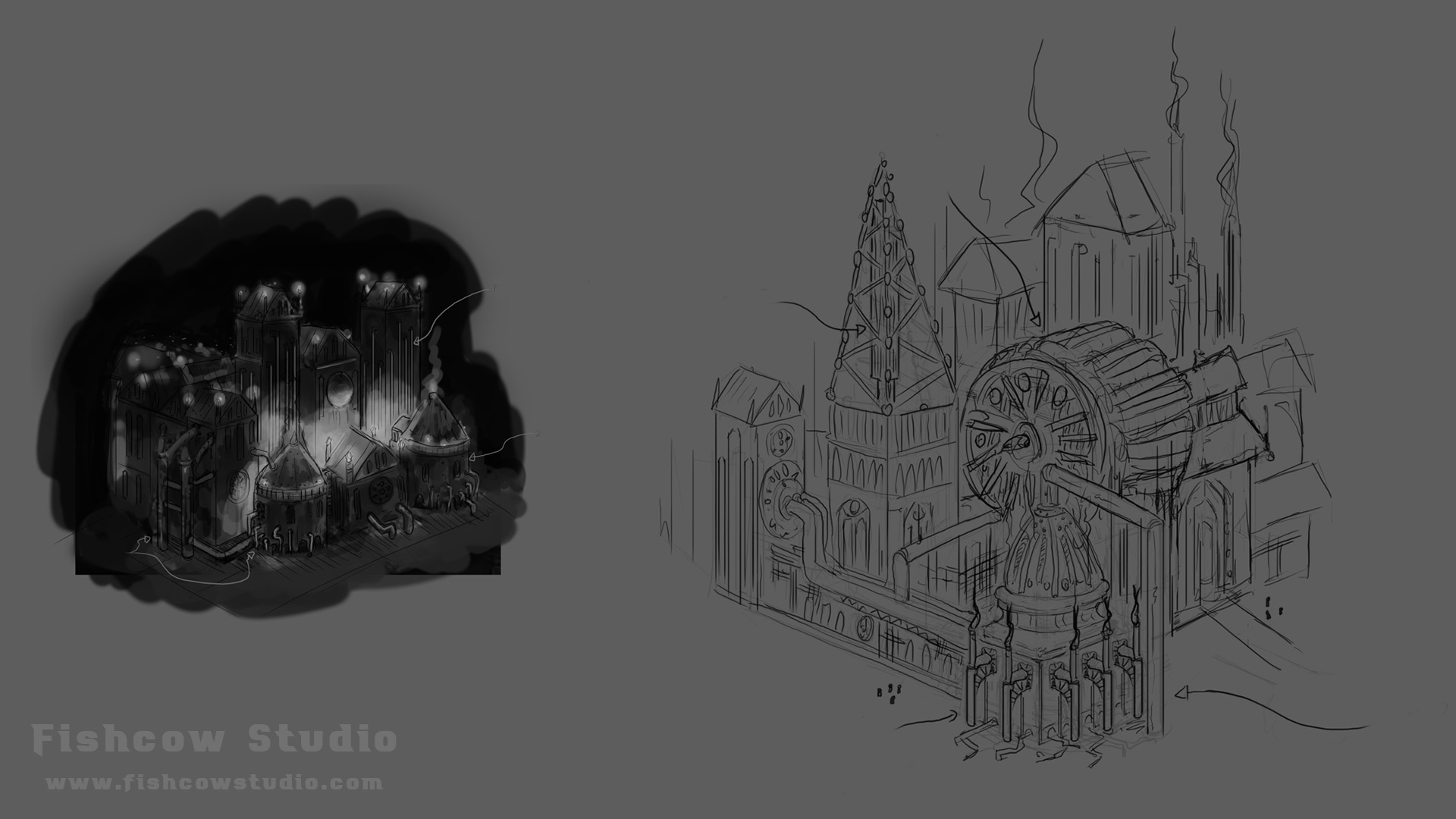
The first type of visual style we tried was lineart graphics. It was our first choice mainly because we liked the creations of our graphic artist Ivan.

Figure 1 – First attempts with lineart graphics

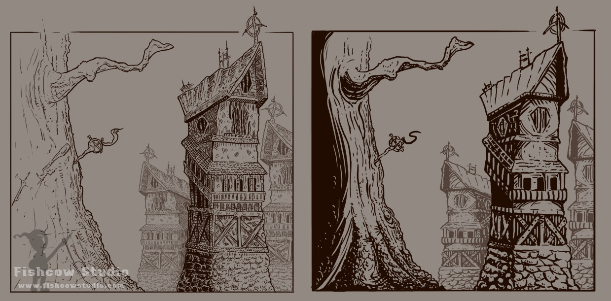
The first attempts were promising. However, we knew that how the game looks in color would be the deciding factor here, so we’ve tried plenty of various color schemes. Here are two we liked the most.

Figure 2 – First color attempts with lineart graphics

We loved the colors and were proud about the results. The sketches met our criteria of both dark atmosphere and interesting visual style.

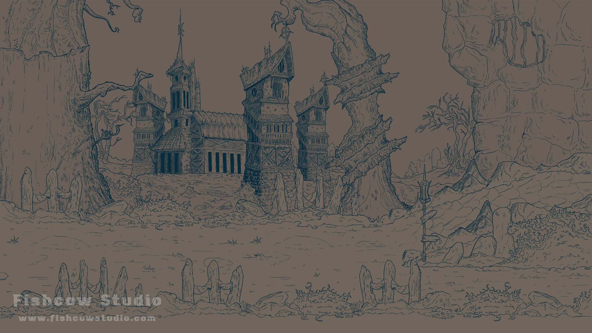
Draft of the game screen

After our first color attempts, we started working on the game screen.

Figure 3 – First sketch of the game screen

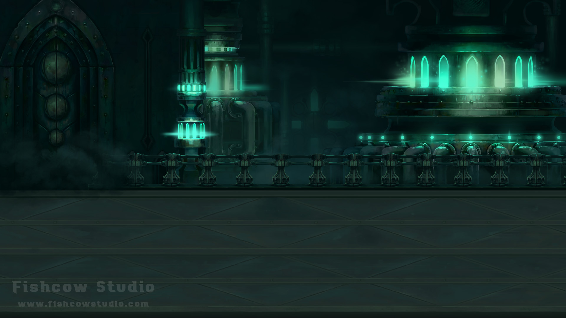
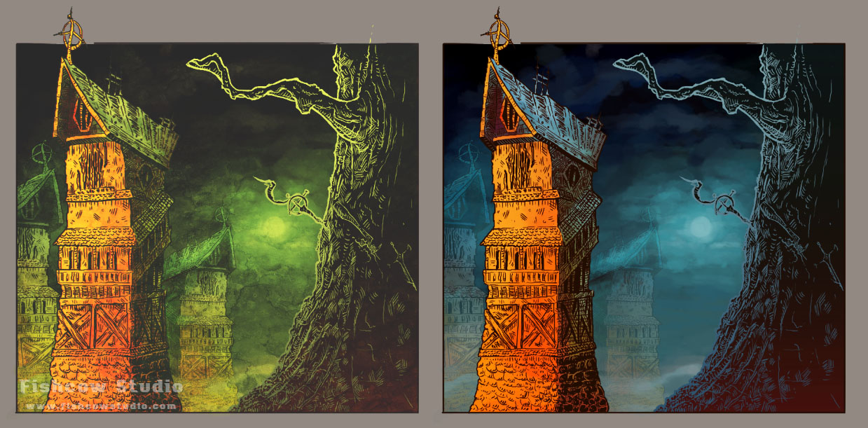
After a while, we thought we had a winner. So we transformed our sketch into colors. We picked the green version (Fig 2, left). It looked like this:

Figure 4 – Game screen in colors

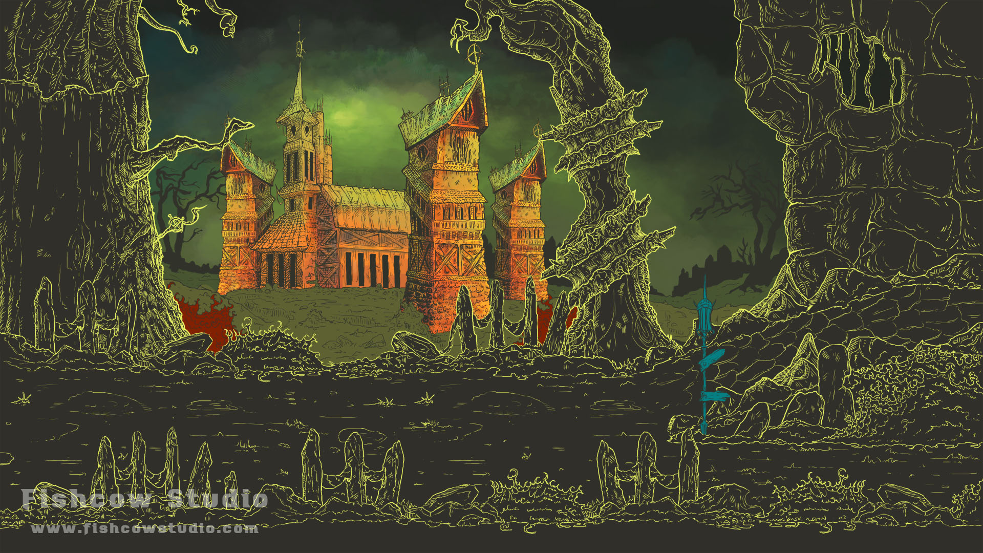
WTF? That’s what we immediately thought. It looked so strange. And we were quite disappointed with the result, since our expectations were so high. We had to try many color variations, such as these:

Figure 5 – 14th version of the visual style, much better than the first one
Figure 6 – 22nd version
Figure 7 – 26th version of visual style, one of the latest

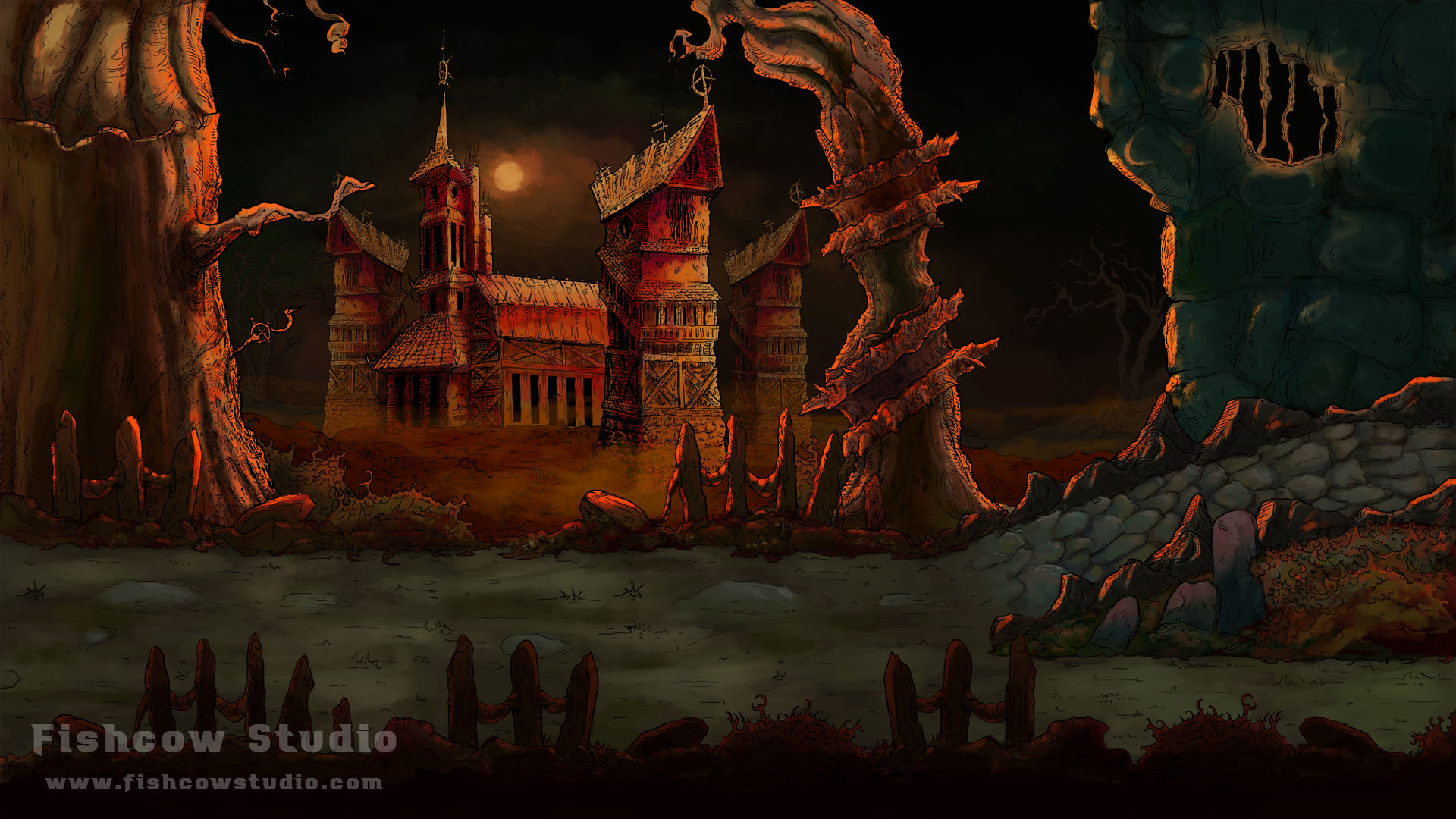
With each one of the thirty or so versions we thought we were approaching our dream. But when we looked at it after all those iterations, we have realized we have a huge elephant in the room. Visibility. The last versions were so dark we almost couldn’t see anything in there. Two weeks of work were in vain. And our vision for the visual style went up in the smoke.
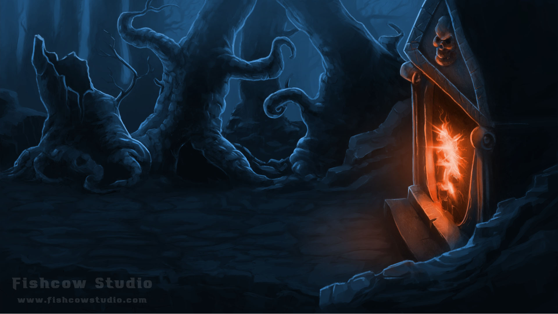
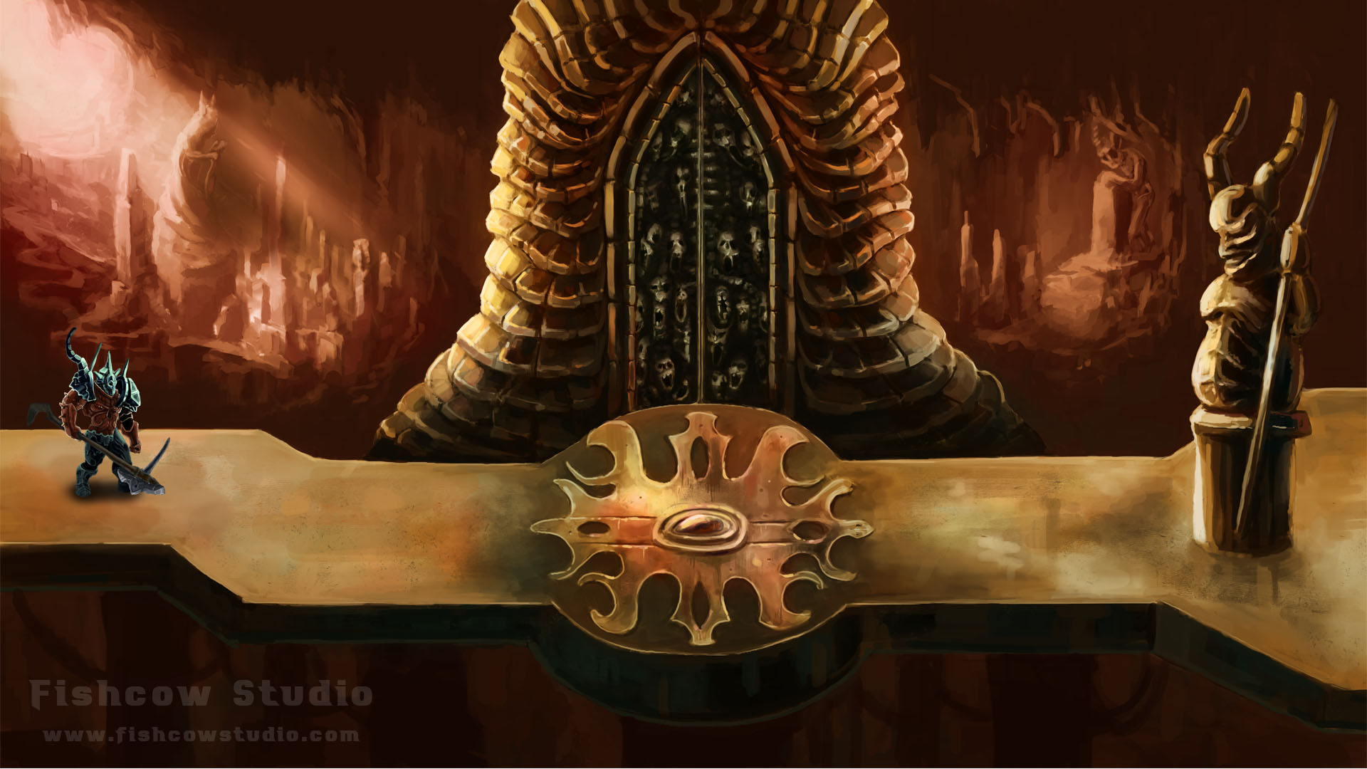
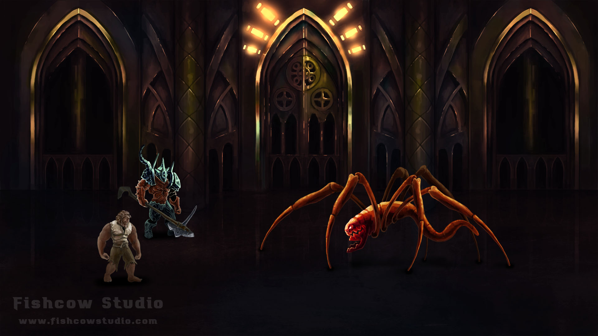
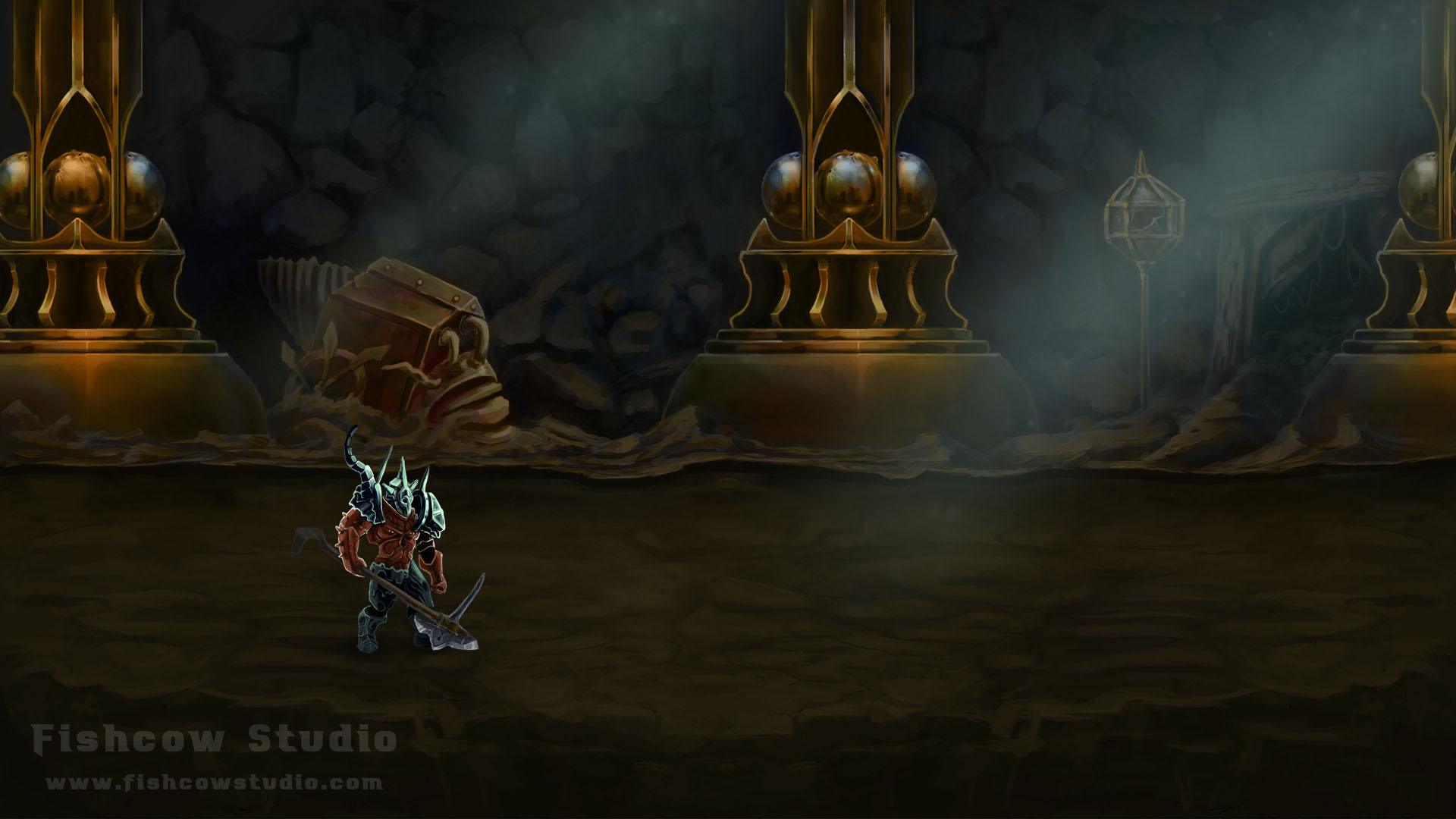
Painted graphics

We started working on painted graphics.

Figure 8 – First attempts with painted graphics

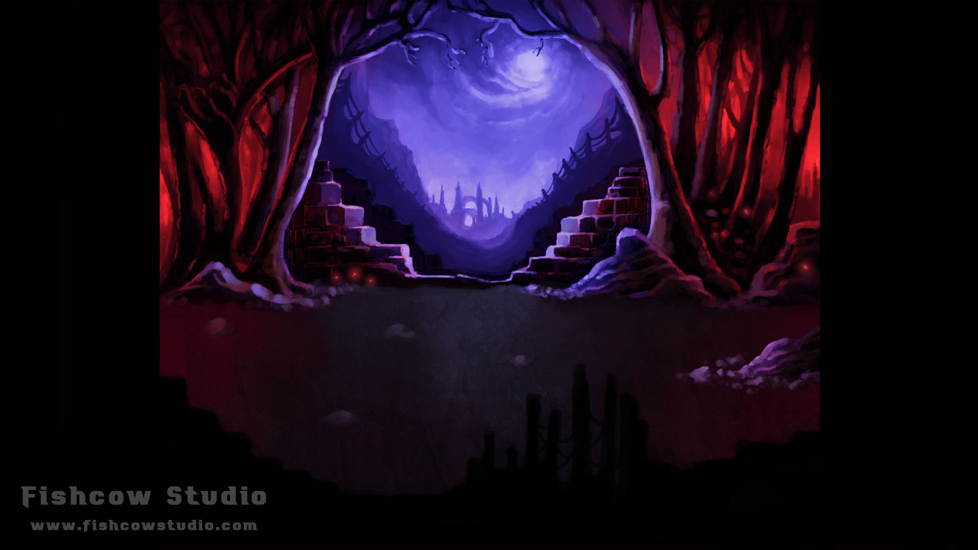
This looked much better, and more importantly, everything was visible. However, it looked like some classic adventure game. We tweaked it a bit and the result looked like this:

Figure 9 – Improved version of painted graphics

Wow! We loved that. Finally, after two months of attempts, we have found our visual style. We were free to work on other important aspects, after all.

That’s all folks! And feel free to comment and discuss.

Previously, we’ve shown our earliest attempts to set our world in a classic fantasy setting. In this blog, we’ll cover the rest of the process of finding a proper setting for Moonfall.

Technologic Medieval

In January 2016, we really made a lot of progress on the game’s setting. We knew we wanted to focus on a dark gothic world and enhance it with new features. We tried implementing some technological advances:

Figure 1 – huge medieval tank, horse-powered train, medieval motorcycles, and other concept ideas

Chinese Gothic

Later, we tried combining gothic with other styles. For example, here is a blend of gothic and Chinese architecture:

Figure 2 – a concept of mixture between Chinese and gothic styles

We were very happy with how the combination between Chinese and gothic looked. That’s why we tested it as a game location, like this:

Figure 3 – mock-up of a location with Chinese gothic

Industrial Gothic – Alternative Medieval

Despite the fact that the Chinese gothic was the best-looking so far, we still weren’t 100% on board. Therefore we went back to the idea of enhancing the medieval world with technology. We also liked how Dishonored approached the idea of taking a certain time period and enhancing it with their own cool ideas. We were testing many ideas until we finally got to the industrial gothic setting. We knew immediately after the first sketches that we hit the jackpot!

Figure 4 – industrial gothic concepts
Figure 5 – industrial gothic concepts

We have agreed on a setting, so we started making new concepts of locations:

Figure 6 – concept of an industrial gothic location

And we had the winner! After that, we started coming up with new ideas and technologies, and describing how they worked in our version of an alternate medieval world. We knew that we couldn’t settle with just industrial gothic, so we focused on the stark contrast between the highly advanced empire and the rest of the world.

Thanks to this, we were able to implement some really cool features, such as a gothic style tank on a medieval battlefield. But let’s not skip ahead! We want to keep some things secret, so you can discover them in the game by yourselves.

In the meantime, you can be looking forward to the story behind the visual style of our game in our upcoming blog.

Recently, we have announced our upcoming 2D RPG Moonfall. We want you get an insight into the inner workings of our studio, so we’ve decided to write a series of blog posts from behind the trenches.

The style and setting of the game was a culmination of a longer process. If you’d like to know why we’ve decided to pursue the way of dark industrial gothic world, an alternative version of our Medieval age, continue reading.

Since this topic includes loads of artworks and concepts of work-in-progress, we’ve split it into two parts. The first part covers the development until the end of 2015.

Classic 2D Fantasy

At the earliest, we were poking around two settings for the game (see Figure 1). One was a sci-fi post-apocalyptic world, the other one classic fantasy. After a while, we made a choice to try fantasy. We like the setting, because we are big fans of fantasy games so we can lean on already widely understood design choices. Hence, we spent the first four months working with a version of the game set in a dark fantasy world.

Figure 1 – Choice of the game's setting
Figure 1 – Choice of the game’s setting

After we had chosen the setting, we embarked on the process of creating the story and designing our fantasy world (see Figure 2). We wanted a vivid and varied world, ranging from mild forests to frozen and volcanic locations. At first, we thought we had it figured out, and we could focus on another important task – choosing the right visual style. That turned out to be a more challenging issue than we thought and slowed us down by at least two months. We’ll describe the whole process in another blog, later.

Figure 2 – Concepts from our fantasy settings

Locations design

After resolving the issues surrounding the choice of our unique, hand painted visual style, we started working on the locations themselves. We also started working on the outlines of the story – the first version was a very simple, standard story of a hero standing up to new evil forces and saving the world (luckily, we have ditched that one!).

Here are some early sketches of the game’s locations. In the picture from one of the dungeons, you can see our original hero. We’ll discuss him and other characters in yet another dev blog, coming up later.

Figure 3 – Edge of the forest from our fantasy world
Figure 4 – Inside the forest from our fantasy world
Figure 5 – Dungeon and original hero from our fantasy world

Problems with the setting

In December 2015, we had realized just how much saturated the market is with dark fantasy games like Diablo. Even though we were sure that our game had some distinct features, such as point of view from the side and a unique visual style, we saw that as a potential problem. So, we started the process of adjusting the story and setting. The first thing we tried was infusing the game with gothic elements, which improved the looks, but still didn’t really cut it.

Figure 6 – Interior of a dungeon-church with gothic influences
Figure 7 – Underground dungeon with gothic influences

That’s all for now, folks. Next week, we’ll finish the topic of Setting the World Style. You can expect plenty of new artworks and you’ll get to know how the technological medieval world was created and what a Chinese gothic could look like!

Fishcow proudly presents: Moonfall

Ladies and Gentlemen, the time has finally come to unveil MOONFALL, our upcoming side-scrolling RPG with beautiful hand-painted graphics, story driven gameplay set in an industrial gothic world, atmospheric music, and many more features.

moonfall_cover_light

With that, of course, comes an official MOONFALL website and a Facebook page. Like and follow to get the latest news and pictures from the game and insights behind the scenes of our studio.